Need assistance with dashboard creation, interactive report design, data visualisation, metric tracking, tool integrations, or any other data analytics challenge? Catering to both for small businesses or large enterprises, our dedicated team is always ready to deliver a solution tailored just for you.
If you’re struggling with data visualisation, our experts will help get it sorted. Our analysts are available for on-site and remote consultations 7-days a week. We use a range of tools specific to each unique situation to help you get the best result possible!
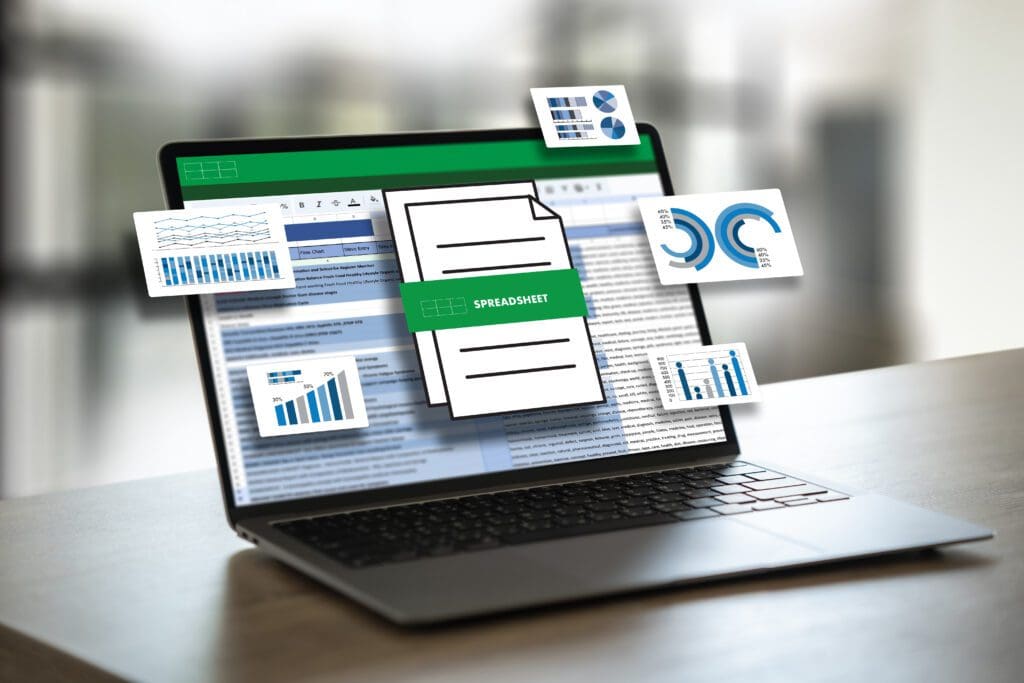
Before diving into the design, we aim to grasp your dashboard aspirations thoroughly.
Rather than immediately delving into the data, it's crucial for us to get acquainted with your industry, business dynamics, team operations, daily tasks, and, with your permission, your personal perspective. This holistic understanding enables us to truly align with your needs, jointly refine your goals, and pinpoint the visual strategies that best address them.
If you have a preference for specific reporting platforms we'll certainly incorporate that preference into our approach.
While we pride ourselves on our adaptability across various industries, we believe in a tailored approach.
This process might require significant tidying and organising. If so, we offer strategic advice to transform cluttered or scattered data sources into a structure that aligns with your goals, from a basic usable format to a comprehensive scalable system.
We invest time in sketching out the final product and comprehending the execution strategy. This ensures that your intended vision and final utility are seamlessly integrated into the development approach.
With our core principles of distinct goals, pristine data, and structured design blueprints, the construction of your dashboard begins on a firm foundation. We leverage several in-house, pre-developed elements, ensuring a swift kick-off to your dashboard's functionality.
Upon the onset of this phase, we'll provide branding guidelines, ensuring that the results resonate with your business's unique character from the get-go.
This phase is commonly termed 'delivery', which can suggest an undue sense of conclusion. To us, it's more than just a handoff; we ensure that the provided elements are integrated within your business, accompanied by user training, comprehensive documentation, and backing for stakeholder engagement.
On a pragmatic note, we advise an initial soft rollout spanning up to 7 days for user acceptance testing, validating the dashboard's resilience in day-to-day operations. Once any last adjustments are made, we transition to a live environment, empowering you to enhance your daily operations.
A staggering 80% of data projects reportedly wane or face outright failure, with complications arising post-deployment as a primary culprit. The emergence of unforeseen technical hitches after the primary consultancy can waver people's enthusiasm towards embracing novel data strategies.
Engaging with you on an extended timeline allows us to smoothly steer through these challenges. We not only keep you updated on the latest advancements in platforms like Power BI and Tableau but also offer sustained support and ongoing education. This aids in fortifying your data proficiency, bolstering stakeholder trust, and firmly embedding your newfound business intelligence within the organisational ethos.
In essence, our approach is both proactive and dedicated, holding ourselves wholly responsible for the solutions we collaboratively bring to life.
We specialise in leading data visualisation tools such as Tableau, Power BI, Excel, and Google Data Studio. Our experts select the tool that aligns best with your specific requirements and existing systems.
Absolutely. Our “Tool Integration and Data Source Configuration” service ensures that data from different sources can be unified seamlessly. Whether your data is in spreadsheets, databases, or cloud platforms, we can integrate them for a cohesive view.
With our “Automated Reporting and Scheduled Refreshes” service, dashboards can be set to auto-refresh at regular intervals. This ensures that you’re always viewing the most recent and relevant data.
Yes, we do. Our “User Training and Dashboard Adoption Strategies” cater to all proficiency levels. We provide in-depth user guides, best practice sessions, and hands-on training to ensure users feel confident navigating and utilising the dashboards.
Performance is a top priority for us. Our “Performance Optimisation for Large Data Sets” service focuses on enhancing load times, implementing efficient data querying methods, and devising strategies to handle vast data volumes without sacrificing dashboard responsiveness.
Subscribe for news and updates
We acknowledge the Turrbal and Jagera people, Traditional Custodians of the land where Transparent Computing operates. We pay respects to their Elders, past, present, and emerging, and acknowledge their continuing connection to land, sea, and community. We commit to learning, respect, and collaboration, honouring the enduring cultures of First Nations’ Peoples.
We acknowledge the Turrbal and Jagera people, Traditional Custodians of the land where Transparent Computing operates. We pay respects to their Elders, past, present, and emerging, and acknowledge their continuing connection to land, sea, and community. We commit to learning, respect, and collaboration, honouring the enduring cultures of First Nations’ Peoples.